Innovative Data Visualization: Crafting Word Clouds and Analyzing Sentiment

In my recent project, I explored the intersection of data visualization and sentiment analysis by creating dynamic word clouds. This project allowed me to harness new techniques in Python and develop a fresh approach to visualizing text data. Here’s an overview of the project and the skills I gained.

Project Overview

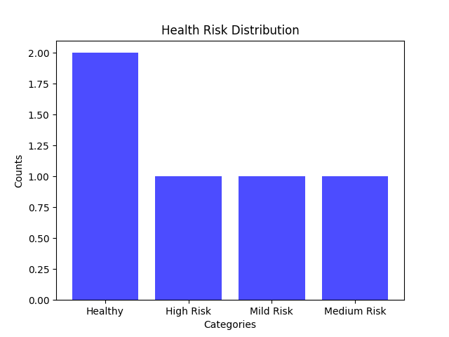
The goal of this project was to enhance data visualization capabilities and apply sentiment analysis to textual data. By creating word clouds, I aimed to visually represent the frequency and significance of words, making it easier to identify key themes and emotions within the text.

Skills and Techniques

  1. Sentiment Analysis in Python
    • I used Python libraries such as NLTK (Natural Language Toolkit) and TextBlob for sentiment analysis. These tools enabled me to analyze the sentiment of text data, categorizing it into positive, negative, or neutral sentiments. This analysis was crucial for understanding the emotional tone of the content and provided valuable insights into how different words and phrases contribute to the overall sentiment.
  2. Creating Word Clouds
    • I utilized the WordCloud library in Python to generate visually appealing word clouds. This involved preprocessing text data to remove common stopwords and punctuation, ensuring that the word clouds accurately reflected the most relevant terms. I experimented with various shapes, colors, and fonts to enhance the visual impact and align with the project’s objectives.
  3. New Styles of Data Visualization
    • The project pushed the boundaries of traditional data visualization by incorporating creative design elements into the word clouds. I explored different styles and formats to represent text data in a way that was both informative and engaging. This approach allowed me to present data in a more visually dynamic manner, making it easier to convey complex information at a glance.
  4. Code and Implementation
    • Here is a brief overview of the code used in this project:

# Start with loading all necessary libraries
import numpy as np
import pandas as pd
from os import path
from PIL import Image
from wordcloud import WordCloud, STOPWORDS, ImageColorGenerator

import matplotlib.pyplot as plt
%matplotlib inline

import warnings
warnings.filterwarnings("ignore")

from nltk.tokenize import word_tokenize
# Creating the diary input function to create a diary dictionary
def collect_entries():
    entries = []
    while True:
        date = input("Enter the date (YYYY-MM-DD) or type 'done' to finish: ")
        if date.lower() == 'done':
            break
        entry = input("Enter the diary entry: ")
        entries.append({"date": date, "entry": entry})
    return entries

diary_data = collect_entries()


import nltk
from nltk.tokenize import word_tokenize
nltk.download('punkt')
#create empty string 
text = ''
#concatenating entries to empty string for wordcloud
for entry in diary_data:
    text += entry["entry"] + " "
wordcloud = WordCloud(background_color="white").generate(text)

plt.imshow(wordcloud, interpolation='bilinear')
plt.axis("off")
plt.show()

Wordcloud workbook

Outcomes and Reflections

This project demonstrated the power of combining sentiment analysis with creative data visualization techniques. By generating word clouds and analyzing sentiment, I was able to provide a comprehensive view of the textual data. The visual representations not only highlighted key themes but also offered insights into the emotional tone of the content.

The skills gained from this project include advanced text processing, sentiment analysis, and innovative data visualization techniques. These skills are essential for effectively communicating insights and enhancing data-driven decision-making.

Looking Ahead

I’m excited to continue exploring new ways to visualize data and analyze text. This project has opened up possibilities for applying these techniques to various contexts, from business analytics to academic research. If you have any questions or would like to discuss this project further, please feel free to reach out.

Health Insights: A Python Project for Patient Data Analysis

Over the past week, I’ve been working on a healthcare-related programming project to challenge myself. It’s been a departure from my usual work with data sets, but it has pushed me to think more abstractly. I’m proud of the outcome! Below, you’ll find the video walkthrough and the code for reference.

Video Walkthrough
Visualization Output
Here is the reference code
def calculate_avg(patients):
total_age = sum(patient[1] for patient in patients)
total_patients = len(patients)
return total_age / total_patients if total_patients > 0 else 0

def categorize_bp(patient):
systolic, diastolic = patient[3], patient[4]
if systolic >= 130 or 80 <= diastolic >= 89:
return "High Blood Pressure", 1
elif 120 <= systolic < 130 and diastolic < 80:
return "Elevated Blood Pressure", 0.5
elif systolic < 120 and diastolic < 80:
return "Healthy Blood Pressure", 0
return "Uncategorized BP", 0

def categorize_hr(patient):
hr = patient[2]
if hr > 100:
return "High HR", 1
elif hr < 60:
return "Low HR", 0.5
else:
return "Normal HR", 0

def obesity_cat(patient):
return "Is Obese" if patient[6] else "Is Not Obese"

def diabetes_cat(patient):
return "Has Diabetes" if patient[5] else "Does Not Have Diabetes"

def calculate_health_points(patient):
bp_category, bp_points = categorize_bp(patient)
hr_category, hr_points = categorize_hr(patient)
obesity_points = 1 if patient[6] else 0
diabetes_points = 1 if patient[5] else 0
total_points = bp_points + hr_points + obesity_points + diabetes_points
return total_points

def categorize_risk(patient):
total_points = calculate_health_points(patient)
if total_points < 1:
return "Healthy"
elif 1 <= total_points < 1.5:
return "Mild Risk"
elif 1.5 <= total_points < 3:
return "Medium Risk"
else:
return "High Risk"

def risk_visualization(patients):
risk_categories = [categorize_risk(patient) for patient in patients]
return risk_categories

def count_risk(patients, risk_level="High Risk"):
return sum(1 for patient in patients if categorize_risk(patient) == risk_level)

def main(patient_data):
while True:
print('\nMenu')
print('1: Calculate Patients Average Age')
print('2: Print Summary of All Patients')
print('3: Print the Number of Obese Patients')
print('4: Print the Number of Diabetic Patients')
print('5: Print the Number of High Risk Patients')
print('6: Visualize the Distribution of Patient Risk')
print('7: Exit')

choice = int(input("Select an option: "))

if choice == 1:
print(f'The average age of patients in the system is {calculate_avg(patient_data)}')

elif choice == 2:
for patient in patient_data:
bp_category, _ = categorize_bp(patient)
hr_category, _ = categorize_hr(patient)
obesity_category = obesity_cat(patient)
diabetes_category = diabetes_cat(patient)
risk_category = categorize_risk(patient)
print(f"\nPatient: {patient[0]}")
print(f"Age: {patient[1]}")
print(f"Blood Pressure: {bp_category}")
print(f"Heart Rate: {hr_category}")
print(f"Obesity: {obesity_category}")
print(f"Diabetes: {diabetes_category}")
print(f"Overall Risk: {risk_category}")

elif choice == 3:
print(f'There are {sum(1 for patient in patient_data if patient[6])} obese patients')
elif choice == 4:
print(f'There are {sum(1 for patient in patient_data if patient[5])} diabetic patients')
elif choice == 5:
print(f'There are {count_risk(patient_data)} high risk patients')
elif choice == 6:
import matplotlib.pyplot as plt
from collections import Counter

counts = Counter(risk_visualization(patient_data))

health_categories = list(counts.keys())
values = list(counts.values())

plt.bar(health_categories, values, color='blue', alpha=0.7)
plt.xlabel('Categories')
plt.ylabel('Counts')
plt.title('Health Risk Distribution')
plt.show()
elif choice == 7:
print('Thank you!')
break
else:
print("Invalid option please try again")

if __name__ == "__main__":
patient_data = []
num_patients = int(input('How many patients do you have today? '))
for i in range(num_patients):
print(f"Patient Number: {1 + i}")
patient_name = input("Patient Name: ")
patient_age = int(input('Patient Age: '))
patient_hr = int(input("Heart Rate (bpm): "))
patient_systolic = int(input("Systolic BP (mmhg): "))
patient_diastolic = int(input("Diastolic BP (mmhg): "))
patient_diabetes = bool(int(input("Diabetes Status (0= No, 1= Yes): ")))
patient_obese = bool(int(input('Obesity Status (0= No, 1= Yes): ')))
patient_data.append([patient_name, patient_age, patient_hr, patient_systolic, patient_diastolic, patient_diabetes, patient_obese])
main(patient_data)


Exploring Primary Care Ratios in North Carolina Counties

In an effort to improve my data analysis skills within the field of Public Health, I am currently working on an analysis of healthcare access across three different counties in North Carolina. This initial analysis focuses on the ratio of primary care physicians to residents, a crucial aspect of understanding healthcare resource availability. The counties under scrutiny include Mecklenburg County, Anson County, and Stanly County, chosen deliberately from different tiers defined by the North Carolina Department of Commerce (County Distress Rankings (Tiers) | NC Commerce). Mecklenburg sits in Tier 3, offering a contrast to Cumberland County in Tier 1 and Guilford County in Tier 2. These tiers, determined by factors like unemployment rates, median household income, growth percentage, and property tax base per capita, set the stage for a nuanced examination of healthcare disparities. Tier three indicates the highest standing and tier one indicates the lowest.

Number of Primary Care Physicians Across Three North Carolina Counties

The graph above illustrates the count of active Primary Care Physicians, utilizing data sourced from the Vital Statistics and Health dataset provided by the North Carolina Department of Health and Human Services. Acknowledging substantial variations in county sizes, as highlighted in the second graph, I opted to shift the focus toward examining the ratio of primary care physicians to residents. This choice offers a more equitable comparison, considering the difference in population size of the counties of interest. By emphasizing ratios over raw numbers, we gain a more nuanced understanding of healthcare accessibility in relation to the population size of each county.

Population Trends Across Three NC Counties

As per the Healthy North Carolina 2030 goals set by the North Carolina Institute of Medicine, the optimal physician-to-population ratio stands at 1:1500. In the visual representation below, I’ve charted the actual physician-to-population ratios for the three examined counties. Accompanying this chart is a reference line, showcasing the target ratio proposed by the North Carolina Institute of Medicine.

Physician to Population Ratio Across Three NC Counties

Analyzing the data across Mecklenburg, Guilford, and Cumberland counties, a notable trend emerges. Mecklenburg and Guilford counties consistently surpass the ideal physician-to-population ratio. This aligns with expectations, considering their urban profiles, higher income potential, and developmental status, making them attractive destinations for physicians.

In contrast, Cumberland County experiences dips below the optimal ratio in specific years, notably in 2011, 2017, 2018, 2019, and 2022. This pattern corresponds with Cumberland’s relatively rural character, where a scattering of towns and cities, led by Fayetteville, constitutes the majority of the population.

As the nation grapples with a primary care shortage, rural counties like Cumberland bear the brunt of the impact. Implementing technologies such as telemedicine and expanding the role of Nurse Practitioners and Physician Associates can serve as crucial measures to address healthcare disparities in these rural communities.

Recognizing the enduring significance of primary care physicians in public health, these professionals play a vital role in disease prevention and detection through routine check-ups. Moreover, they provide essential health education to patients and effectively manage chronic diseases. As we navigate the complexities of healthcare access, it becomes increasingly evident that sustaining a robust primary care infrastructure is indispensable for promoting the health of our communities.


Goals and Outcomes

Synthesizing Data with Context from Valid Sources: To enhance the depth of my analysis, I factored in the county tier rankings along with the physician ratio guidelines outlined by the North Carolina Institute of Medicine’s Healthy North Carolina 2030 initiative. This additional layer of information contributes valuable context to the examination, offering insights into the broader healthcare goals and standards set for the state.

Integrating Multiple Data Sources: I integrated data from both the North Carolina Department of Health and Human Services and the US Census to formulate a comprehensive physician-to-population ratio. This step allowed for a more robust and nuanced analysis, providing a clearer picture of the healthcare landscape across the selected counties.

Creating Clear Visualizations

Questioning Data Validity: Examining the graphs of primary care physician counts across the three counties, I noticed a common pattern with a peak around 2015 or 2016. To ensure accuracy, I attempted to cross-verify this data using other sources reporting primary care physician numbers in North Carolina by county. Despite my efforts, I couldn’t find additional information or an explanation for the observed peak. However, I proceeded with the analysis, trusting the North Carolina Department of Health and Human Services as the most reliable source for this data.


Dataset source: https://linc.osbm.nc.gov/

County Population source: https://www.census.gov/

North Carolina Healthy People 2030 Primary Care Goals: https://nciom.org/wp-content/uploads/2020/01/Primary-Care-Workforce.pdf

Interwoven Insights: Mapping Sleep’s Affinity

Winter break is always a nice time to catch up on those personal projects that have yet to be crossed off the to-do list.

Today, I had the opportunity to work in the DataCamp workspace to analyze dummy sleep data. I decided to concentrate on visualizations for this project as I am working on enhancing my data storytelling skills. In the upcoming year, I aspire to become an expert in data storytelling, from visualizations to statistical analyses.

North America WHO Maternal Mortality Trends

With the conclusion of the semester, I now have the opportunity to dedicate myself to several personal projects. Among the skills I am keen to enhance, data visualization stands out as a valuable asset applicable across numerous fields, particularly in healthcare and public health. Currently, I have embarked on a personal endeavor that involves analyzing maternal mortality trends spanning from 2000 to 2017, utilizing data sourced from the World Health Organization. My intention is to visually represent these trends by country, focusing initially on North America, while also exploring countries within the same region. Enclosed is my preliminary visualization using R, which highlights the trends observed in Mexico, the United States, and Canada. My enthusiasm continues to grow as I look forward to extending this analysis to encompass the Caribbean nations.

The code is given below:

read.csv("C:\\Users\\Sydney\\Documents\\maternalMortalityRatio.csv")
mm_df <- read.csv("C:\\Users\\Sydney\\Documents\\maternalMortalityRatio.csv")
library(dplyr)
library(ggplot2)
US_df <- mm_df %>% filter(location == "United States of America")
Canada_df <- mm_df %>% filter(location == "Canada")
Mexico_df <- mm_df %>% filter(location == "Mexico")
NA_df <- bind_rows(US_df, Canada_df, Mexico_df)
ggplot(US_df, aes(x = Period, y = First.Tooltip)) + geom_line(color = "blue")
ggplot(Canada_df, aes(x = Period, y = First.Tooltip)) + geom_line(color = "red")
ggplot(mexico_df, aes(x = Period, y = First.Tooltip)) + geom_line(color = "green")
ggplot() +
  geom_line(data = US_df, aes(x = Period, y = First.Tooltip, color = "United States")) +
  geom_line(data = Canada_df, aes(x = Period, y = First.Tooltip, color = "Canada")) +
  geom_line(data = mexico_df, aes(x = Period, y = First.Tooltip, color = "Mexico")) +
  scale_color_manual(values = c("United States" = "blue", "Canada" = "red", "Mexico" = "green")) +
  labs(title = "North America WHO Maternal Mortality Trends 2000-2017", 
       x = "Year", 
       y = "Deaths per 100,000",
       color = "Country") +
  guides(color = guide_legend(title = "Country"))

The source of the data is the WHO which I sourced from Kaggle

https://www.kaggle.com/datasets/utkarshxy/who-worldhealth-statistics-2020-complete?select=maternalMortalityRatio.csv

Black Maternal Health Week

The United States is in a maternal mortality crisis. According to the CDC, the US is currently seeing an uptick in maternal mortality rates. Over the last 50 years, maternal mortality rates had increased from 7 deaths out of 100,000 live births to 32.9 deaths out of 100,000 live births. The maternal mortality rate for African American women is even more alarming, with 69.9 deaths per 100,000 live births.

My interest in the field of public health was sparked by this issue.

To gain a qualitative perspective on this issue, I conducted a study using a phenomenological approach to analyze the birthing experiences of African American women. Through personal narratives, these women provide a unique insight into the birthing crisis in America, which can complement statistical analysis and help develop effective solutions. The narratives revealed common themes such as lack of control, disempowerment, and racial discrimination. To address the maternal mortality crisis in America measures such as employee racial competency training and diversifying healthcare teams can be taken. However, further research with a larger sample size can provide additional insight into the common themes surrounding the birthing experience of African American women.

Source: Hoyert DL. Maternal mortality rates in the United States, 2021. NCHS Health E-Stats. 2023.
DOI: https://dx.doi.org/10.15620/cdc:124678

Reflecting On My Role As a Research Analyst in the Corporate Wellness Space

I just completed my internship with Leah Marone, LCSW, a corporate wellness consultant, through Gardhouse. Over the past six months, I have been exposed to a side of public health that I was previously unaware of. Working in workplace health and wellness with Leah Marone has allowed me to sharpen my research and data analytics skills as well as develop health and wellness communication skills. I assisted her in advertising her services and educating her audience by creating canva posts for her LinkedIn. 

I was able to observe the development process of a group wellness intervention that Leah and Kristin Meyer organized; I also compiled resources for the intervention. My long-term project for this internship was market research on Charlotte employees’ perspectives on health initiatives and corporate wellness culture. 

My research tested my practical application of statistical analysis, and my ability to manipulate data in R, gather relevant sources, and think critically about data and sources. I struggled quite a bit in this process but in turn, I have applicable skills for future research and found a love for data analytics. 

My project consisted of surveys and interviews with Charlotte, North Carolina employees to gather insight into the current state of corporate wellness initiatives, corporate culture, and the desires employees have for the future. A review of the current literature was done to develop the survey and it was distributed through Linkedin. Factors such as age, gender, work modality, and corporate culture were analyzed alongside reported job stress contribution to overall stress.

It was found that among those surveyed employees working in-person reported the highest job stress contribution averaging 3.11 on a scale of 1 to 4 followed by remote workers averaging 2.53, and lastly hybrid workers at 2.21. Interviews were consistent with these results with multiple interviewees stating that hybrid was the preferred work modality due to flexibility while maintaining connections with other coworkers. 

Gender did not show large differences in mean stress contribution with men averaging at 2.52 and women at 2.47. On average, baby boomers reported the least amount of job stress contribution at 2.4 while generation X reported the highest at 2.785. 

Aspects of corporate wellness were measured alongside job stress contribution. 

  • Leadership support of health prioritization 
  • Pressure to be available outside of normal work hours 
  • Comfortability to advocate for mental health in the work environment 
  • Job interrupting life outside of normal work hours 
  • Encouragement to take breaks when needed

Aspects that seemed to have a large difference in mean job stress contribution were leadership encouragement of employee prioritization of health, Although the difference of means was not found to be significantly different by means of t-testing. 

Pressure to be available to work outside of normal hours and incidence of job interrupting life outside of work hours were found to be statistically significant factors in job stress contribution. This means there was a large enough difference in means between those with high and low pressure to be available to work outside of normal hours and high and low incidence of job interrupting life outside of normal work hours.

The full paper has additional analysis and interviews. To read it click the link below.