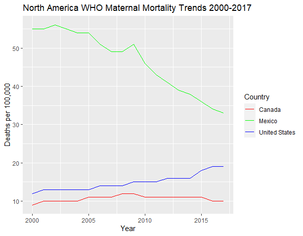
With the conclusion of the semester, I now have the opportunity to dedicate myself to several personal projects. Among the skills I am keen to enhance, data visualization stands out as a valuable asset applicable across numerous fields, particularly in healthcare and public health. Currently, I have embarked on a personal endeavor that involves analyzing maternal mortality trends spanning from 2000 to 2017, utilizing data sourced from the World Health Organization. My intention is to visually represent these trends by country, focusing initially on North America, while also exploring countries within the same region. Enclosed is my preliminary visualization using R, which highlights the trends observed in Mexico, the United States, and Canada. My enthusiasm continues to grow as I look forward to extending this analysis to encompass the Caribbean nations.
The code is given below:
read.csv("C:\\Users\\Sydney\\Documents\\maternalMortalityRatio.csv")
mm_df <- read.csv("C:\\Users\\Sydney\\Documents\\maternalMortalityRatio.csv")
library(dplyr)
library(ggplot2)
US_df <- mm_df %>% filter(location == "United States of America")
Canada_df <- mm_df %>% filter(location == "Canada")
Mexico_df <- mm_df %>% filter(location == "Mexico")
NA_df <- bind_rows(US_df, Canada_df, Mexico_df)
ggplot(US_df, aes(x = Period, y = First.Tooltip)) + geom_line(color = "blue")
ggplot(Canada_df, aes(x = Period, y = First.Tooltip)) + geom_line(color = "red")
ggplot(mexico_df, aes(x = Period, y = First.Tooltip)) + geom_line(color = "green")
ggplot() +
  geom_line(data = US_df, aes(x = Period, y = First.Tooltip, color = "United States")) +
  geom_line(data = Canada_df, aes(x = Period, y = First.Tooltip, color = "Canada")) +
  geom_line(data = mexico_df, aes(x = Period, y = First.Tooltip, color = "Mexico")) +
  scale_color_manual(values = c("United States" = "blue", "Canada" = "red", "Mexico" = "green")) +
  labs(title = "North America WHO Maternal Mortality Trends 2000-2017",
       x = "Year",
       y = "Deaths per 100,000",
       color = "Country") +
  guides(color = guide_legend(title = "Country"))
The source of the data is the WHO which I sourced from Kaggle
